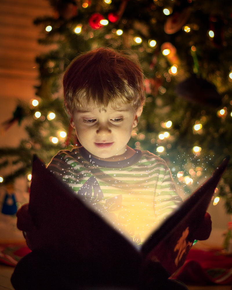
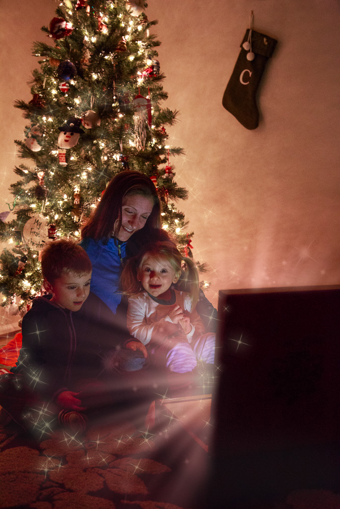
Here’s the first in a series of creating a great Holiday picture that will be great for a card, put on the wall, or just to show off for bragging rights. Even though this is a fairly simple composite, it did teach me a lot about the compositing process and how to get things to work. I made this a few years ago, and although I’d do it a little differently now, I was very happy with the picture I ended with. I used the same techniques a few years later with the rest of my family for a different type of picture.
What do I need?
There are a couple things you are going to need to create this picture. First, you’ll need some sort of camera to take the picture. This can be anything from a phone to a beefy SLR. I do recommend something that can take the picture in a raw format, as dealing with holiday lights is going to wreak havoc on your color balance – most lights have very strong color casts, and although you can set your white balance in most cameras, having the flexibility to fine tune it will help. It will also be dark, since with this your subject will be lit by the decorative lights and one hidden light.
Wait – What is this ‘Hidden’ Light?
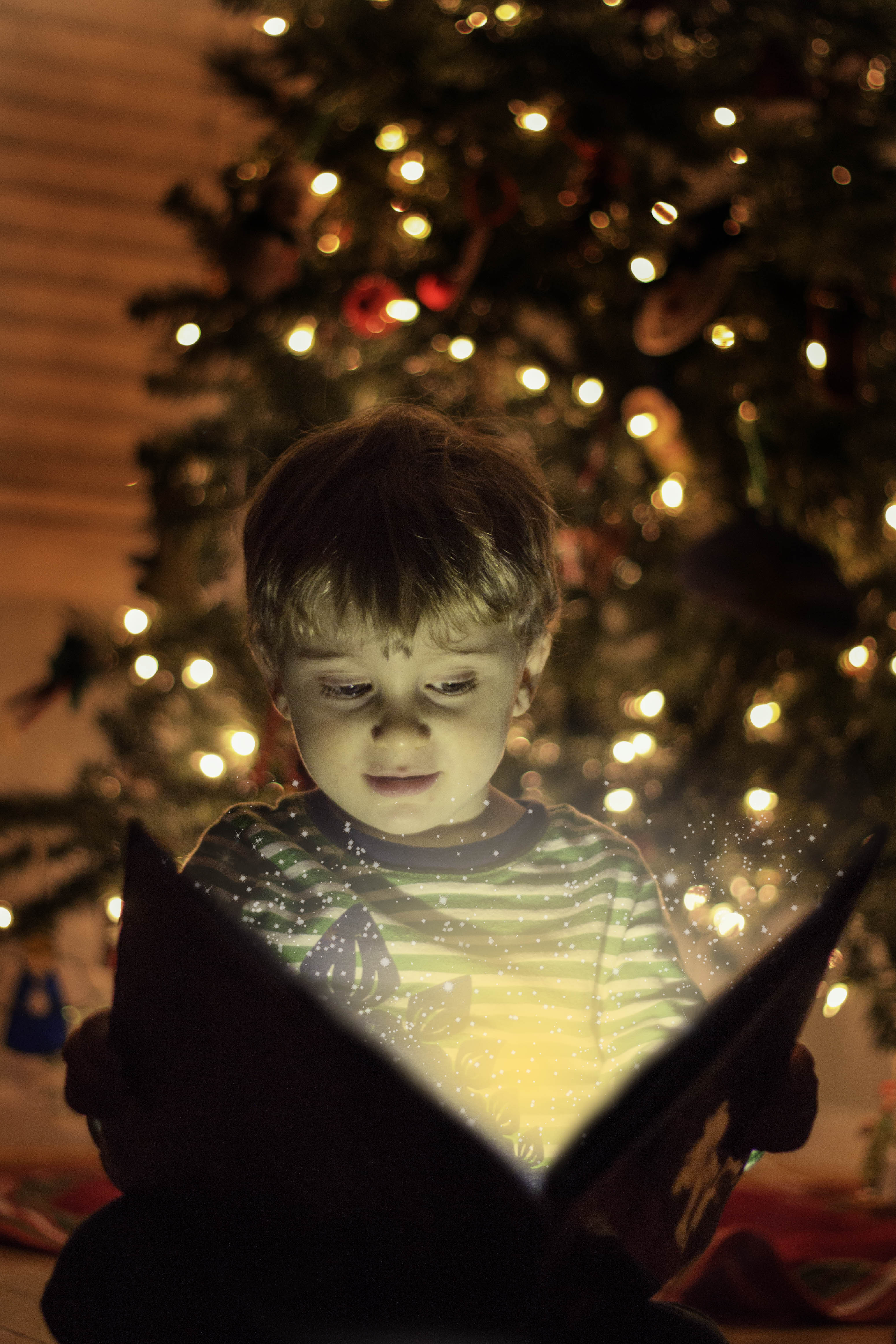
That’s one of the secrets to making this work – the light on his face (and the light coming from the box in the second picture) is from the flashlight from a phone I placed out of sight. For the book picture, I just laid it down with the light pointing up at him. The flashlight work OK, but as you can see it does make a bit of a harsh light and gives him bags under his eyes. I recommend downloading a free softbox app for your phone that will make the entire face glow. You can even fine-tune the color in some of them, which will help to match the color of the rest of the lights and make it all flow better.
Will I need Complicated Software?
Yes, you are going to need software to put this together. And although some of it can be complicated, we are going to keep it relatively simple. What you will need is support for layers. Photoshop is the current standard, but there are lots of alternatives – Affinity Photo and Luminar are both about $60, and GIMP and Paint.net are free. There is also a free online Photoshop clone at photopea.com which will let you do all of this. I’m going to walk through my workflow with Photoshop, but it should translate to any of the editors I mentioned.
What else?
Well, you need a victim subject for your photo. I’ve found bribes tend to work well for this. You will need time – especially if this is the first time you are doing this type of editing. And most importantly – patience. You will make mistakes, you will delete and redo things as you go. This is art, and it’s messy. Some of the techniques might be new to you, and will take time to get right. But keep in mind, it’s all about learning and creating.
Ready? Let’s get Started!
First Steps
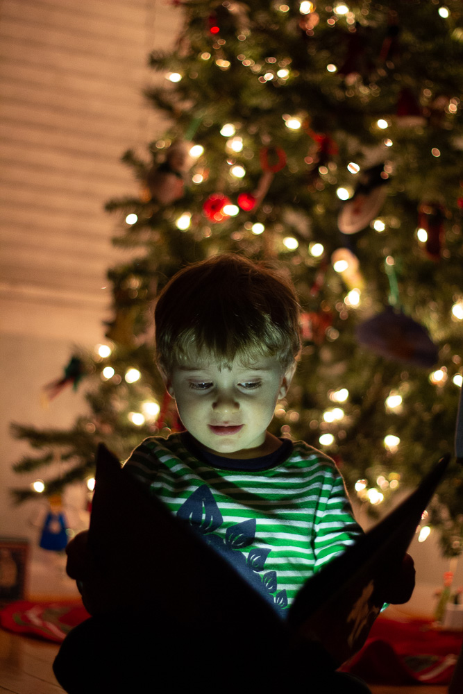
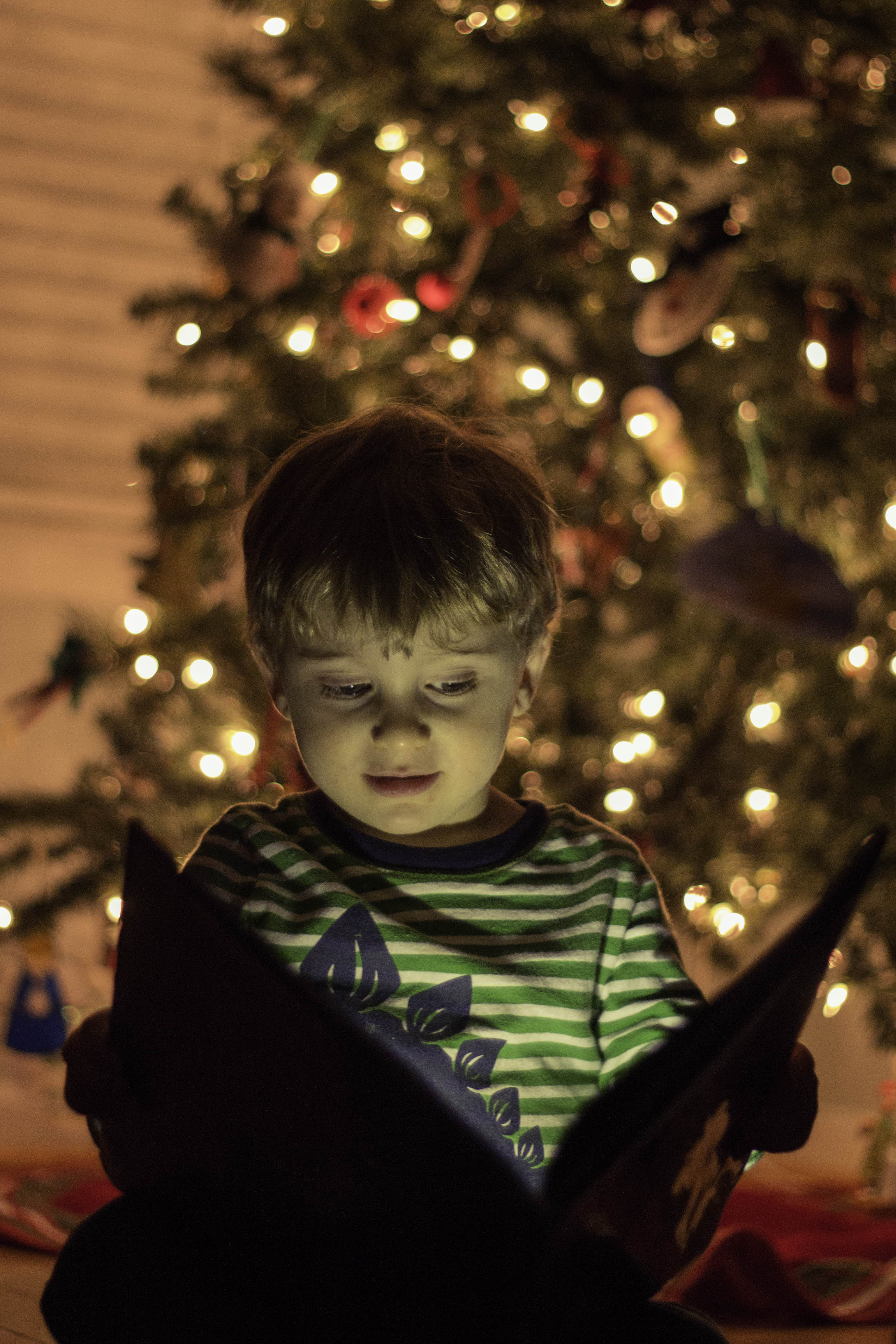
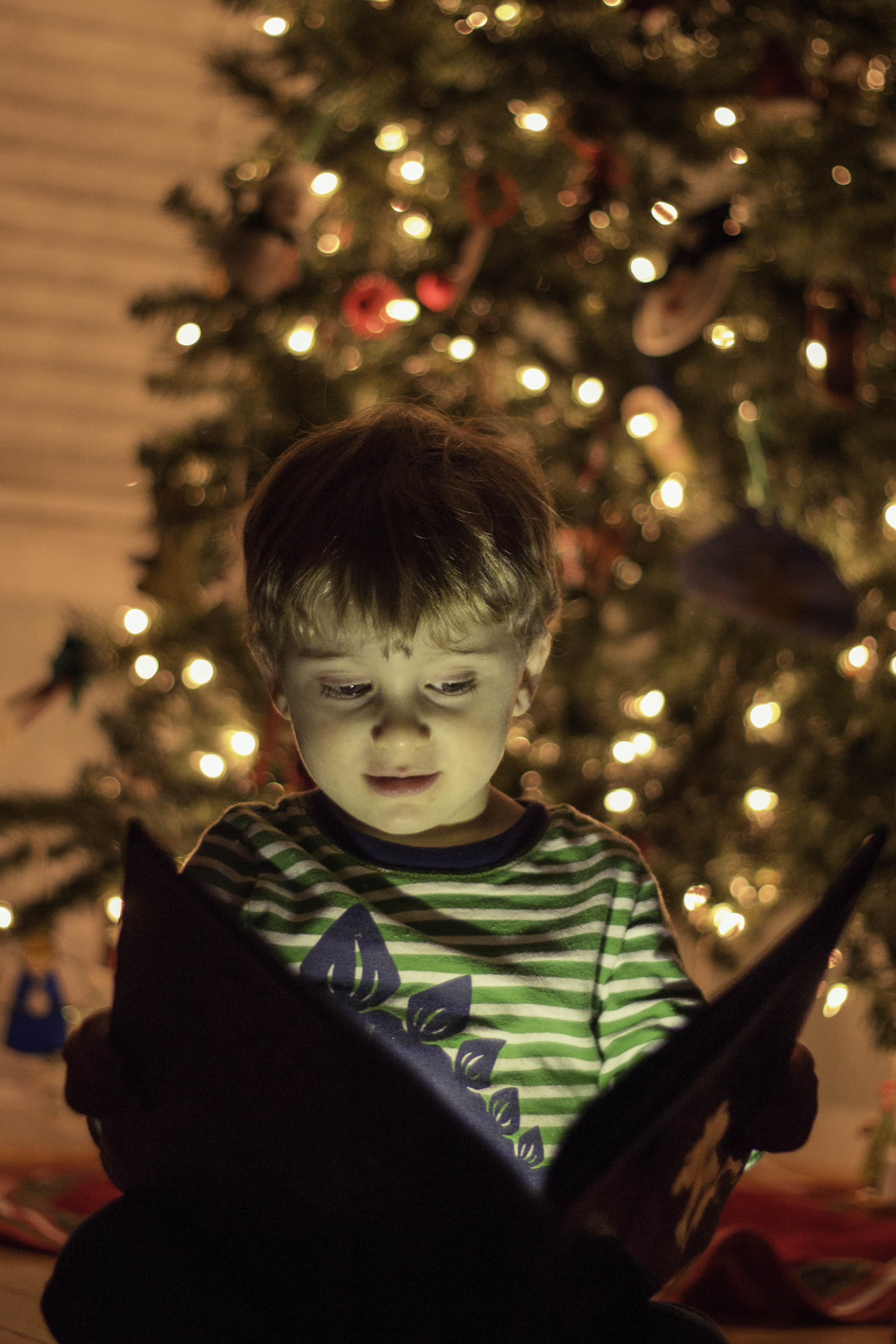
Remember what I said about the color of light? Here it’s really evident. This is the image straight out of camera (I used ISO 1600, a 50mm lens at f/1.8 and 1/60). Notice the warm, reddish background, and the zombie-like green of my son? That’s due to the phone and tree lights being different colors. So, first thing we have to do is fix this. Since my son is the subject, I corrected the lighting for him, and let everything just get pushed with it. In the color temperature, I warmed it up towards the yellows and added a lot of magenta to counteract the greens. I also brought the highlights down and shadows up to reduce the contrast.
On to Photoshop!
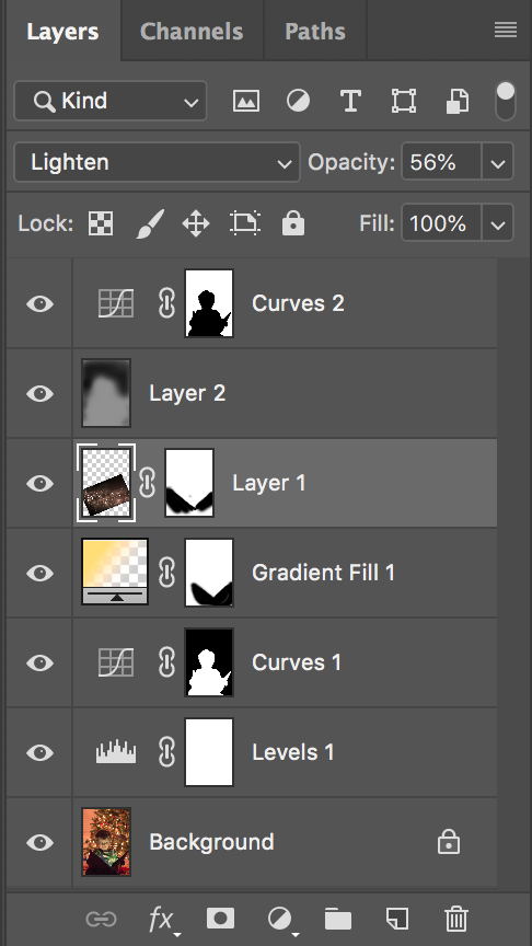
Here’s the Layers panel for my image. It looks complicated, but we’ll go step by step. Once you break it down, it’s not so bad.
Levels 1
I thought the image was too bright overall. In the Levels 1 layer, I dragged the midtones to darken the image, while leaving the black point and light points alone.
Curves 1
Now that the edge has been taken off the image brightness, I felt that my son was too dark overall. I used a curves adjustment layer to brighten my son, and isolated the change to him by using a mask. I used the magic wand tool for the selection, and it worked relatively well. The magic wand can be a bit fiddly, but if you take the time to zoom in and add and subtract areas as you go, you will end up with a reasonable selection
Gradient Fill
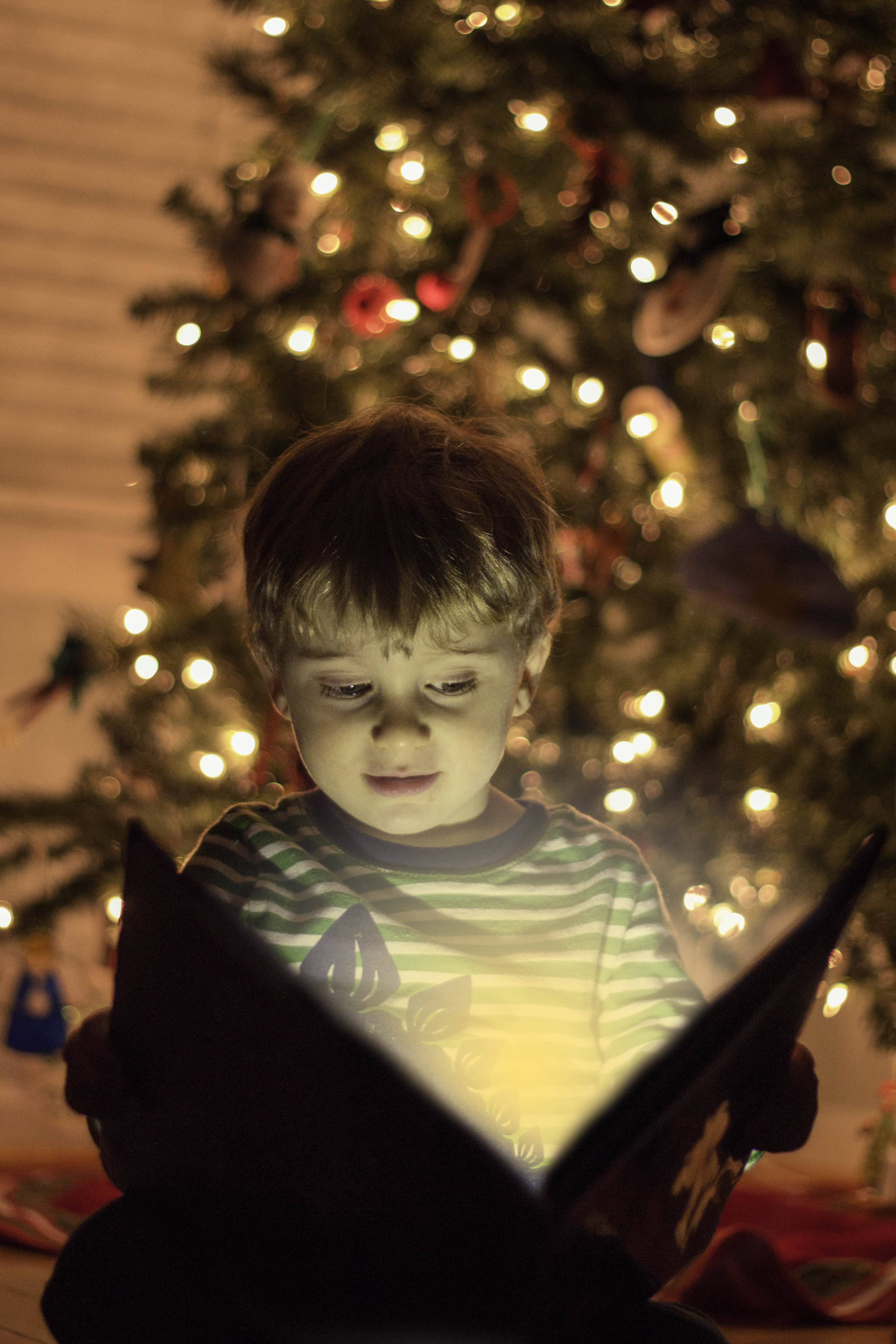
Here is where I started creating the image I had in my mind, rather than just enhancing a photograph. For this, I chose a radial gradient, going from a solid color to transparent. I wanted a golden yellow color, and after trying a few different ones I ended up with R252, G223, B122, also known as #fcdf7a. If you don’t know what that means, not to worry! My values probably won’t apply to what you will want in your image. But the first set of numbers are the Red, Green, and Blue values that will give the color I selected. The second set of numbers are the same, but as a hexadecimal value. I came to my final color by clicking in the palette, but entering the numbers may give you a place to start. When you make your radial gradient, it will be round and cover the book or whatever object you are using. You need to add a mask and paint out the gradient where it would logically be blocked to make it look like it’s behind the object. When painting it out, use a soft or feathered brush for this – you’ll want a slight bit of spill onto the edges of the object, as this is what happens in real life. If you use a hard edged brush, it won’t look as natural, and any uneven lines in your mask will be very apparent.
Layer 1

Layer 1 is the sparkle layer. I had gotten this as a free download from the site DeviantArt, but unfortunately the creator no longer offers it, she has moved everything to an Etsy site. But there are still plenty of places to get free sparkle overlays – just plug ‘free sparkle overlay’ into google and you will find lots of options.
When you look at the layers panel above, you’ll notice that the sparkle image is black with light sparkles. If the layer was applied to the image normally, the black in the sparkle image would obscure my picture. But all we want are the bright sparkles. To get this, we need to change the blend mode of the layer to Lighten. In the Lighten blend mode, only the pixels that are brighter than the underlying layers below will be shown; anything darker will be transparent. With the Lighten blend mode, the black background disappears, and you’re left with the sparkles. Then you can resize and position the overlay as you see fit, and mask it out where you don’t want it to be seen. Also, if the sparkles are overbearing, you can reduce the opacity of the layer to where they look good.
Layer 2
After all the other edits, I still thought the background was too bright, and wanted to darken it more. I used a technique called burning to darken it. There are a number of ways to do this in photoshop, but I prefer to do this on it’s own layer so I can make changes to it later. I add a new layer, then fill that layer with 50% grey. Then, I change the blend mode to Soft Light and the layer turns invisible. With Soft Light, anything brighter than 50% grey lightens the pixels, and anything darker than 50% grey darkens the pixels. So, I choose up a large, soft brush, and set the opacity to something low, like 10%. Then I paint in the darkness a little bit at a time, building up every time I paint over the area. As you paint, rather than painting in a color, it paints in darkness or lightness, depending on if you have a black or white brush selected.
Doing this gave me the darker background I wanted, but also introduced a big problem – it greatly increased the saturation of the reds in the background. It’s enough that it is distracting, so I wanted to fix this.
Curves 2
The Curves 2 layer is what I used to fix the red. This was simply adding another curves adjustment layer, selecting the Red channel, then dragging it down to where it looked better. But, this also changed how my son looked, and I didn’t want him affected. Luckily, I had the selection of him already done in curves 1. So while holding down Option (Alt on a PC) I dragged that mask up to the curves 2 layer, replacing the mask. But, that’s opposite of what I want! Now it’s just affecting my son, not the background. To reverse the mask, make sure the mask (not the image) is selected, and hit Command (or Crtl for PC) + I. That inverts the selection. Now, the background looks much more pleasing.
Wrap Up
And that’s it! If this is your first time doing something like this, it might take a while to do – it’s a learning process. But if you go through the steps, you’ll start getting an idea of how the different tools work, and how you can bring elements into your pictures to make them stand out. Even just a small addition like I did here can get the family talking about your picture and bring out lots of smiles. Plus, when my kids see themselves in the composites I’ve done, it’s fun to watch them get carried away and let their imaginations put them in the final scene as if that was what really happened.
Your Turn
Are you ready to try your hand at a composite like this?


1 Comment
led strip light width · November 25, 2018 at 11:09 pm
Awesome post.
Comments are closed.